Week2 From Scratch 1
Exercise:
Using color shapes, try to create rich gradations in all attributes of shapes such as size, color, brightness, position etc. Try to be inspired and base your design on your identity, could be national, ethnic or anything you identify with that has a visual tradition symbolism.
My idea came from an interesting effect in some Chinese characters. These sets of characters share the same unit and usually have similar meanings. Here are some examples:
| Meaning | (Unit / Single) | (Double) | (Triple) | (Quadruple) |
|---|---|---|---|---|
| Fire | 火 | 炎 | 焱 | 燚 |
| Again | 又 | 双 | 叒 | 叕 |
| Mouth | 口 | 吕 | 品 | 㗊 |
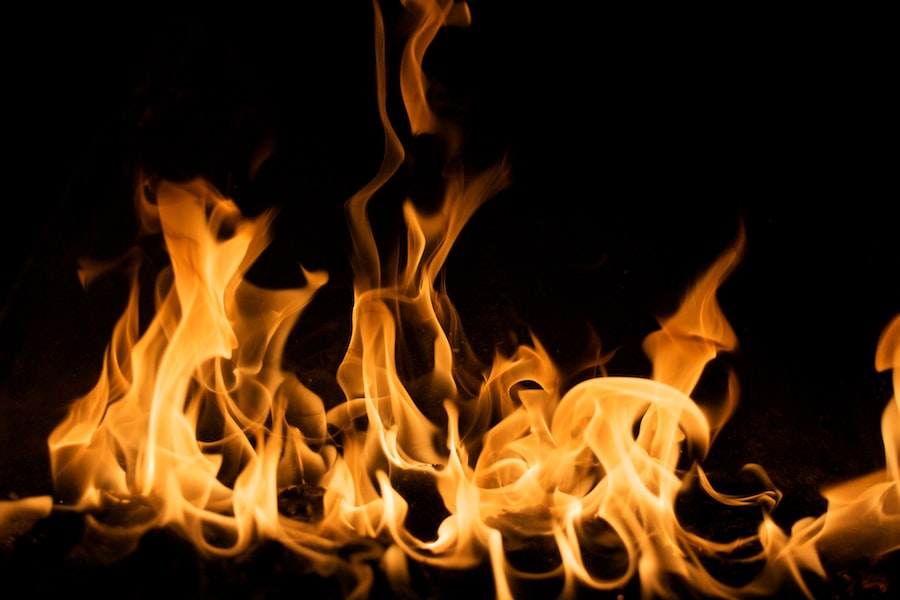
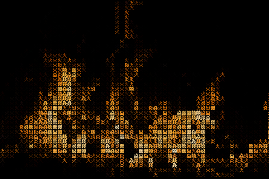
Because of their difference in complexity, mixing a set of these characters can create the illusion of gradients in pixels but still remains in one theme. Although I have made something with this effect last year, I want to utilize the character’s meaning as well. So this is what I did - creating fire with ‘火’(fire).

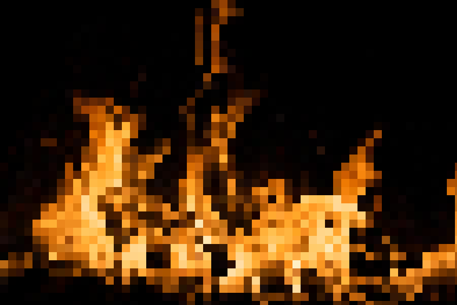
First, pixelate it.

Instead of drawing rectangles, draw a character depending on that pixel’s brightness.
float l = brightness(c);
char t = '火';
if (l > 200) t = '炎';
if (l > 230) t = '焱';
if (l > 254) t = '燚';