Week5 Logo & Brand
Assignment: Create a brand for yourself including a logo, palette and typography. For the logo show your sketches and the process from ideation to completion. Document your brand in a personal style guide.
Logo
I started from some sketches.
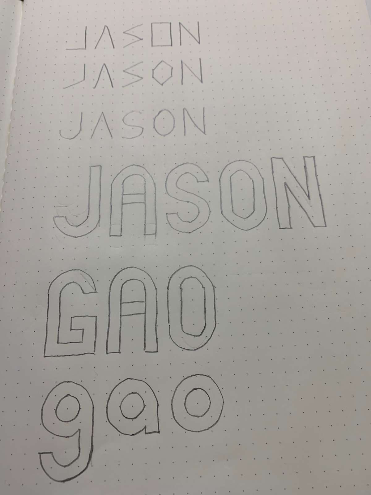
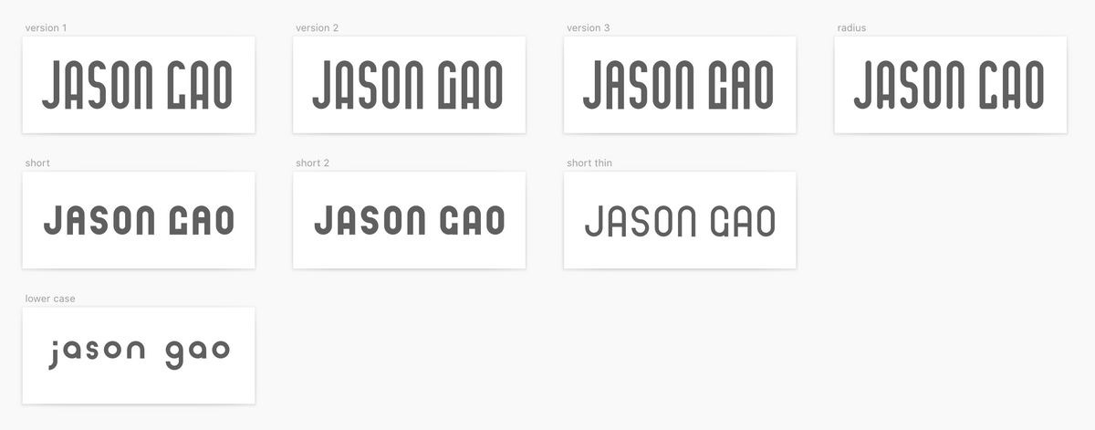
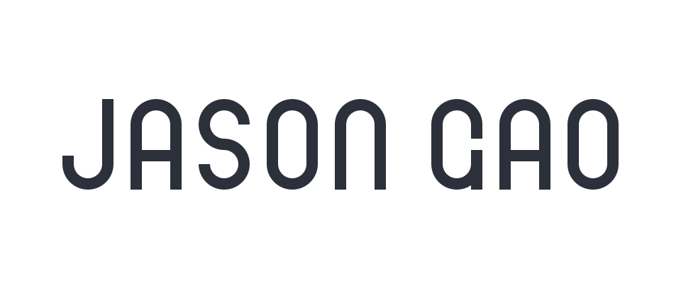
and went into digital. Inspired by the Bauhaus style, I really want my logo to be geometric and modern. So my idea was to only use circle and square. The problem of my first attempt - the tall one is that it is not easy to recognize. Therefore, I lowered the height and made a easy-to-identified ‘G’. The lower case was just a test. Multiple letters are looking weird, but I don’t know how to fix them
Color palette
- The final version was the short thin one with color of #2B303A.
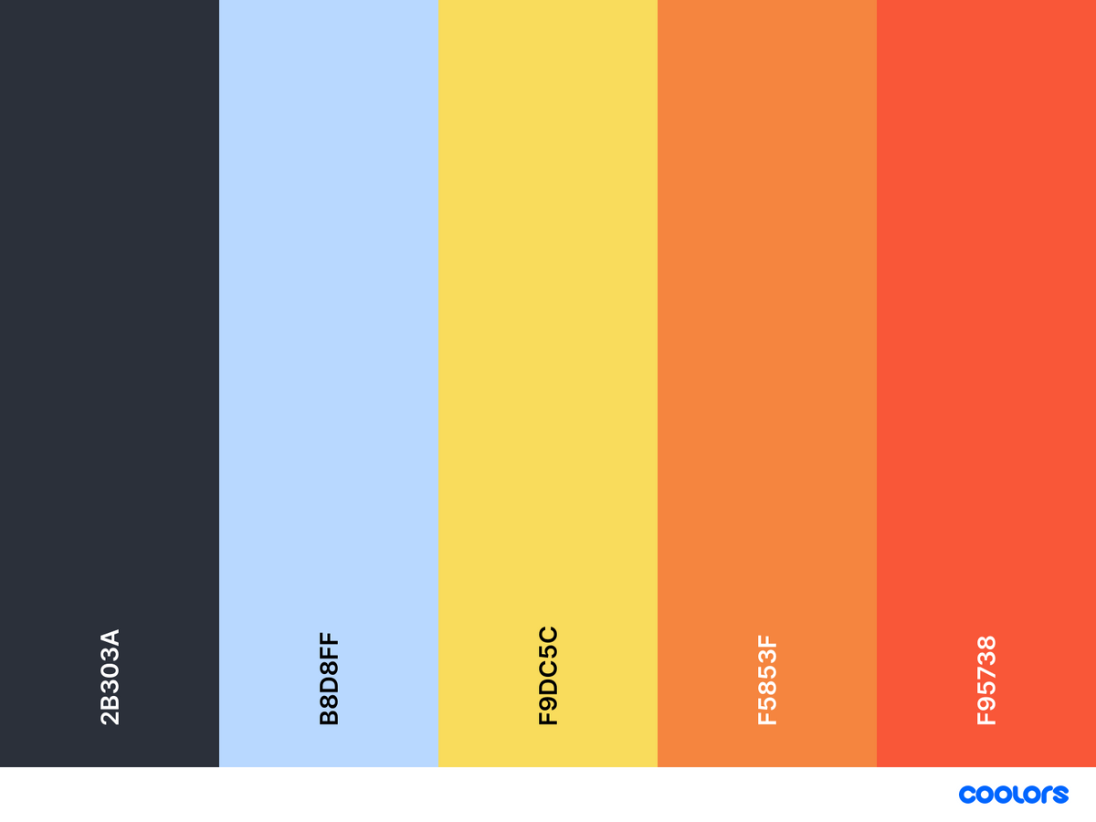
- The color pallete includes a brighter blue and three warm light color for design work.
Typography
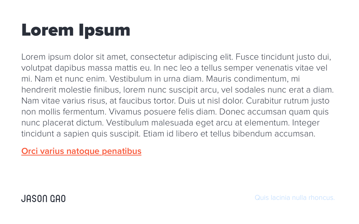
Since most of my works are digital and showed on screens, I picked ‘Proxima Nova’ as the main typeface. It covers a huge amount of font-weight from thin to black and is very easy to read as well. The following is an usage demo.
