Week2 Typography
Redesign a Boarding Pass
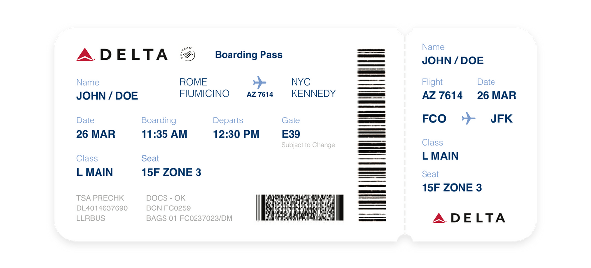
The first thing I did was to classify those information. Most of them should be for passengers, but others like ‘TSA PRECHK’ is definitely for security or other staff members. They can be designed as low hierarchy element since staffs see them everyday and can identify their location and shape intuitively. So that these element won’t affect other more significant information.
There are also elements like ‘BCN FC0259’ and ‘LLRBUS’ which I have no clue what they mean. So I just suppose they are unnecessary for passengers.
-
For passenger
- JOHN DOE
- Date 26MAR
- Departs 12:30PM
- Boarding Time 11:35AM
- Flight AZ7614
- Origin ROME-FIUMICINO
- Destination NYC_KENNEDY
- Class L MAIN
- Seat 15F ZONE 3
- Gate E39 SUBJECT TO CHANGE
-
For staff member
- TSA PRECHK
- DL4014637690
- LLRBUS
- DOCS - OK
- BCN FC0259
- BAGS 01 FC0237023/DM
- QR Code
-
Static Information
- ‘Boarding Pass’
- ‘Operated by Delta Airlines Inc’
- Skyteam LOGO
- Delta LOGO
I picked Helvetica as the main typeface. It’s so well knowned and easy to identify, nothing can goes wrong. Primary elements are in bold weight, while secondarys are in light.
The color was from Delta Brand Guildlines’s color palette. A primary blue, a secondary red for logo, and a tertiary light blue for secondary info.
Final Result:

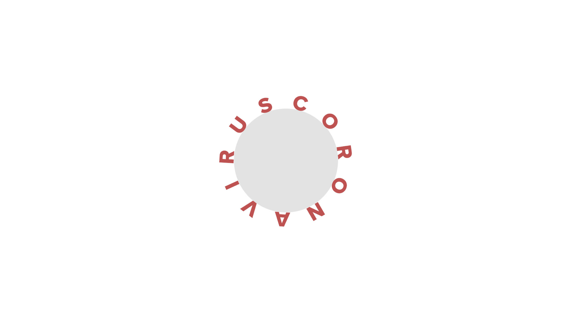
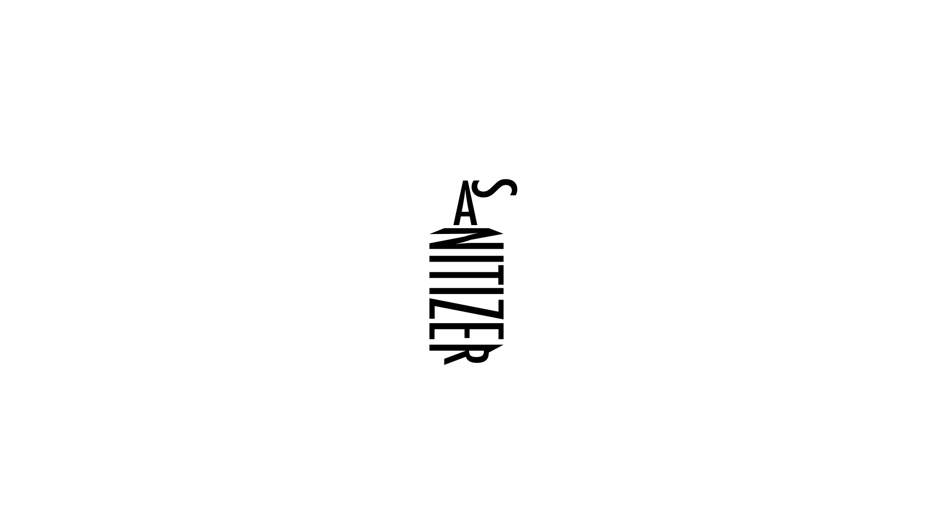
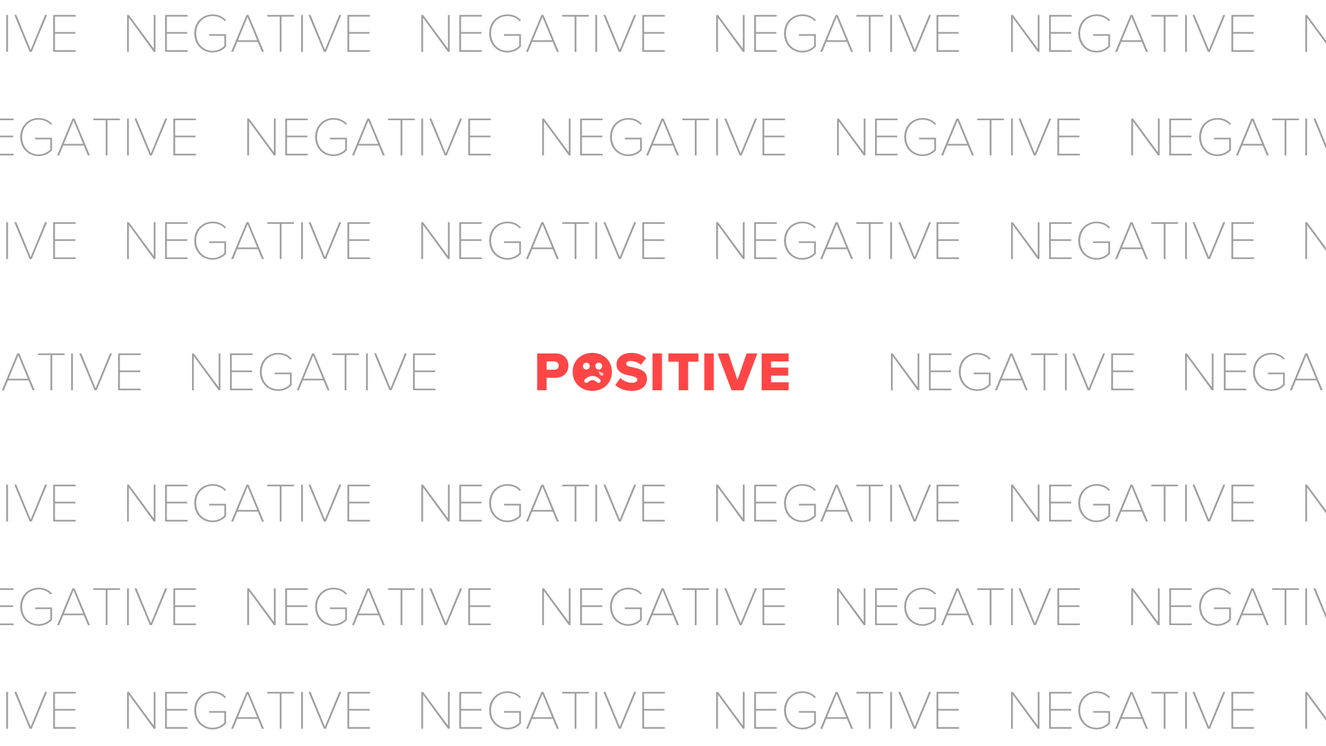
Expressive words
Under the theme of ‘COVID-19’


